Giftees Website Redesign
Cooperated on the complete re-vitalisation and re-design of a platform that used online communication to assist in physical gift-giving — created by the aspiring company Giftees, based in Amsterdam.
The Problem
An existing digital presence that is not representing the brand as expected. While the core identity is in place, the site lacks visual consistency and fails to communicate the warmth and approachability central to the brand. There is no desire for a re-brand, but rather a complete overhaul of everything the user sees and interacts with.
(A new illustration system, a rebuilt component library, end-to-end user testing, and the design of several new pages to better serve the site's goals.)
The Approach
The company, Giftees, celebrates expressions of love and gratitude through gift-giving. They created a platform that allows users to purchase gifts for long-distance companions from their own local goods & services — celebrating relationship, as well as local economies. As designers, this project was closely aligned with our own values, making the processes substantially less challenging.
The first step we took towards improving their website was understanding their brand and business goals. We wanted to formulate a deep understanding of their values and core identity. Meeting with the owner allowed us to establish a mutual understanding of not only his brand, but also the full scope of expectations — as well as the ideal version of his desired outcome.
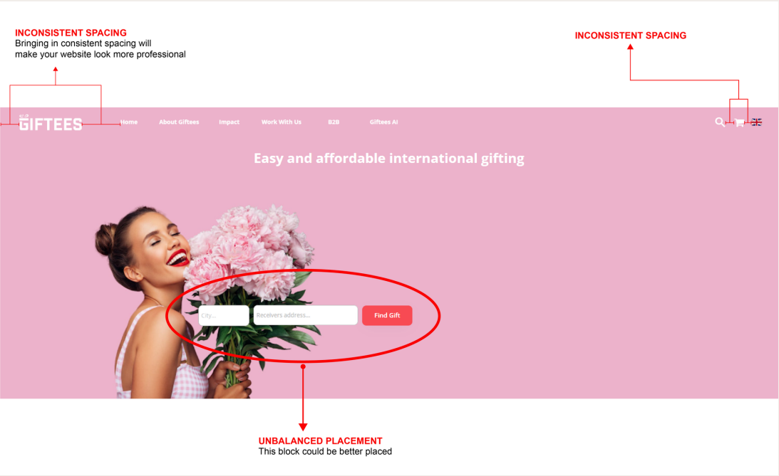
We decided to create a presentation in which we cross-referenced our understanding of his brand with the website that was currently in use. Including both annotations of features that we felt were effective, as well as detailed criticism, helped the client understand where the original design was successful and also where it fell-short. The changes we suggested to alter the look and feel were consistency based — spacing, icons, colour, repetitive layout, and font/element sizing. The presentation also included rough Wireframes of potential layouts and minor changes that could be made.
We went ahead and created a few high-fidelity variations of the Landing Page Hero. By allowing the client to select his preference, we would have a more exact understanding of the desired look & feel for the new website. We presented 3 variations of the Hero, and the client selected aspects from each one. Combining these together was a fairly simple process — leaving us with the perfect foundation for the remainder of the design. Before continuing, we began redesigning all of the existing icons and components used in the website, as well as creating new ones where we felt more visuals might be required.
Progress
Visuals provided for various ‘landmarks’ throughout the duration of the project.
Presentation for Client
We presented the client with a breakdown and analysis of their existing website.
It included positive comments as well as more constructive critique to illustrate where our services would be most valuable.
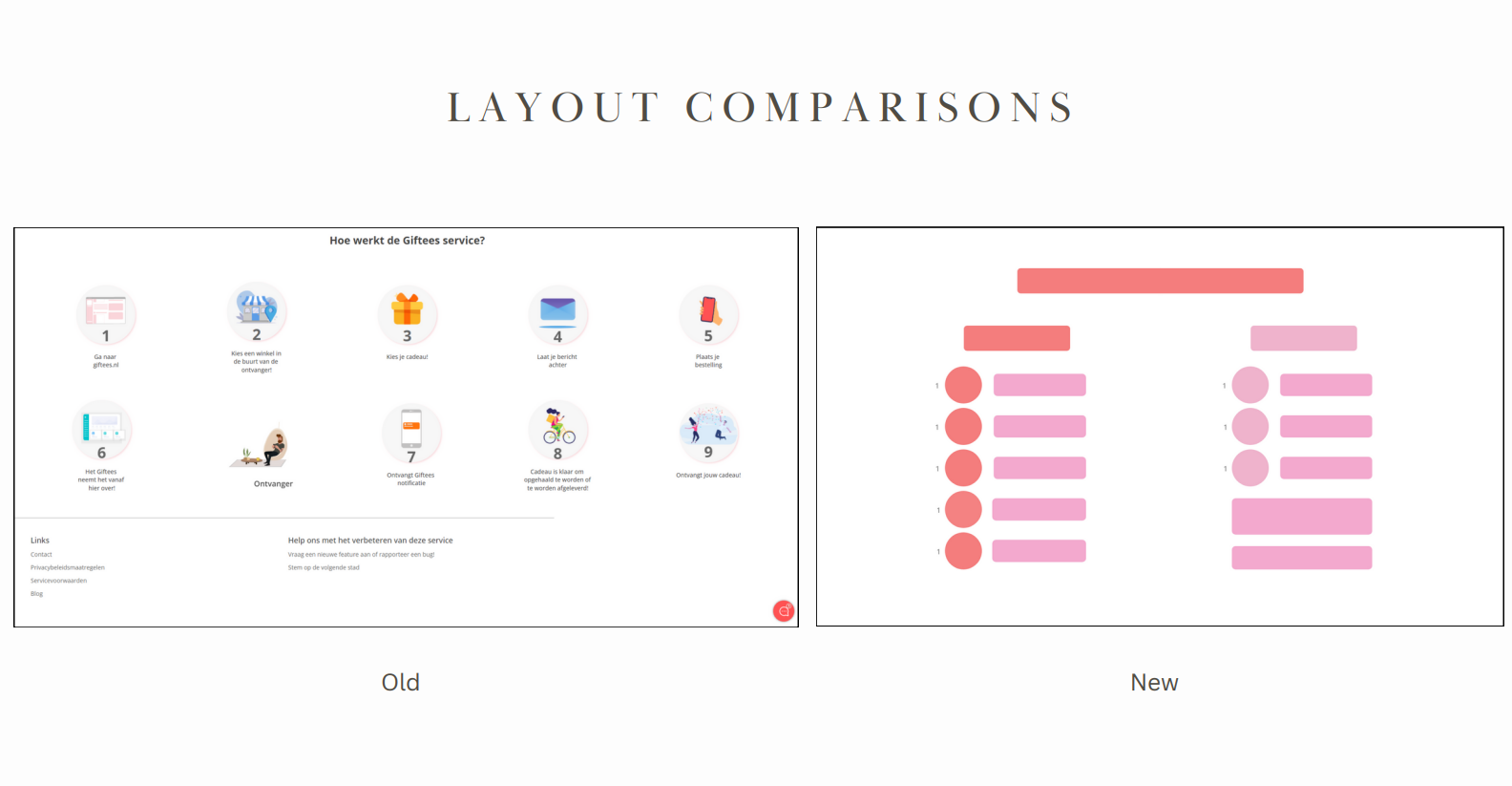
Rough — Unofficial Wireframes
We picked sections of the website we felt could use a complete re-design and created very rough and unofficial wireframes.
These layout examples were to assist the client in visualizing the potential changes, as well as nurture suspense and excitement.
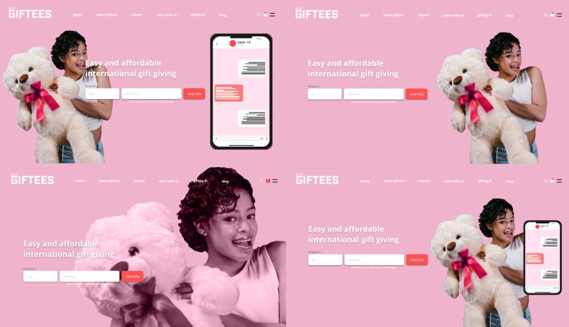
Hero Variation Options
We then created a few High-Fidelity versions of the Hero which included aspects the client wanted. (Flags to represent location, a phone showing a staged SMS convo, etc.)
The client was aware that these were not final and would still be altered.
Icons & Component System Redesign
We compiled a list of the website's existing icons, as well as icons we wanted to include. These would be redesigned to be consistent to the brand, as well as each other.
This process was lengthy, but really polished the final look & feel.
Outcome
The final product was a cohesive and friendly website that represented the brand and its values in a more appropriate and accurate way. The new colour palette, layout, icons, and components helped fulfill the client's ideal design.
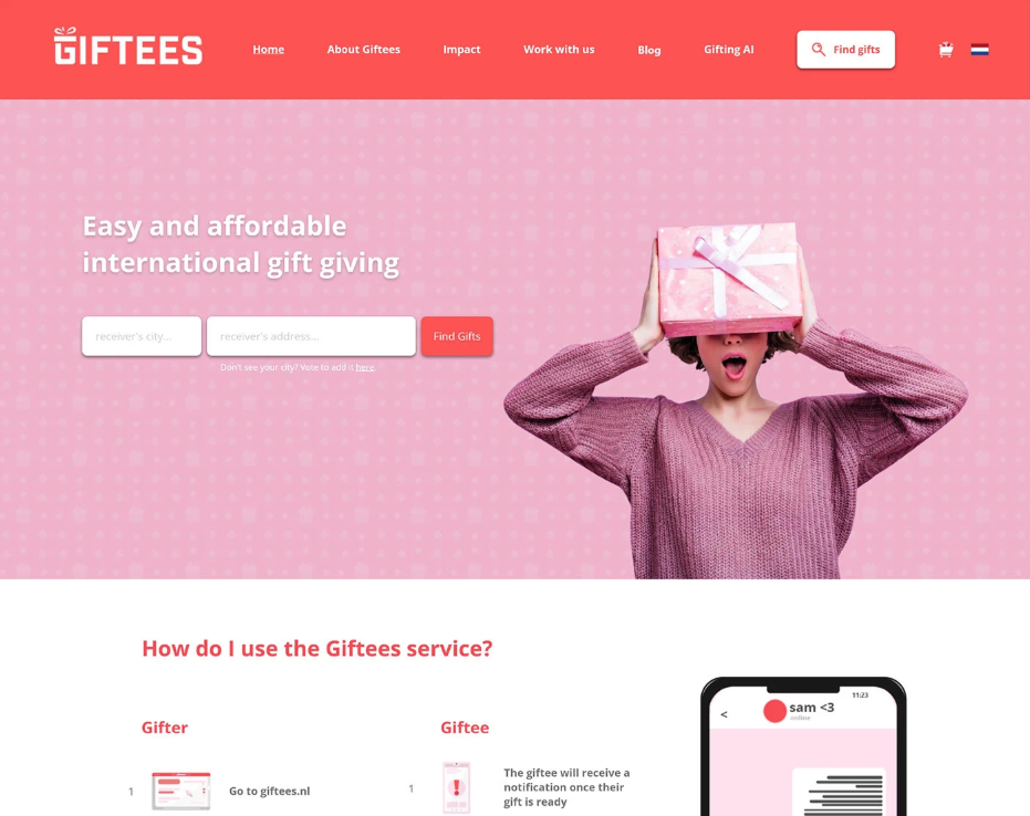
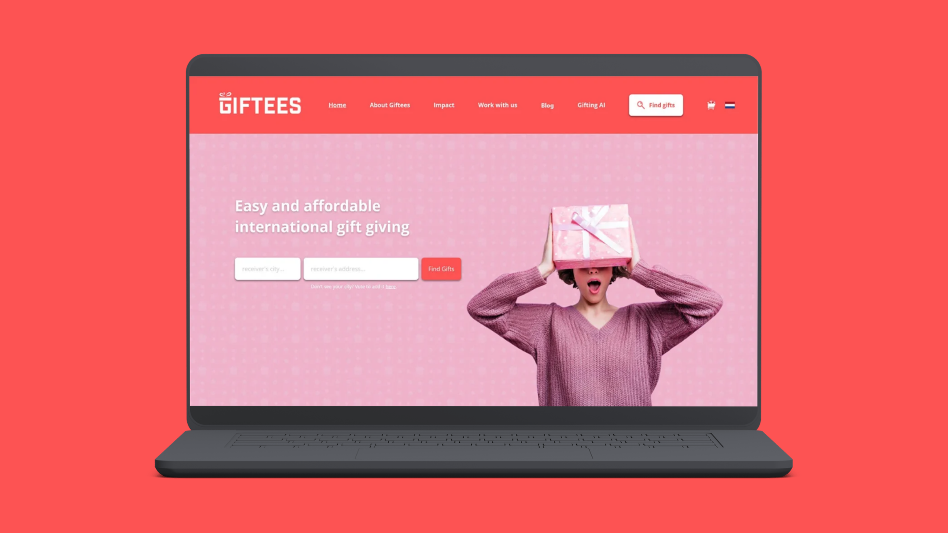
Redesigned Hero Section
As well as part of the new instructions with the custom icons and colours. The SMS conversation was moved below to reduce clutter.
The cart in the top right becomes filled with small gift icons when you are ready to check out.
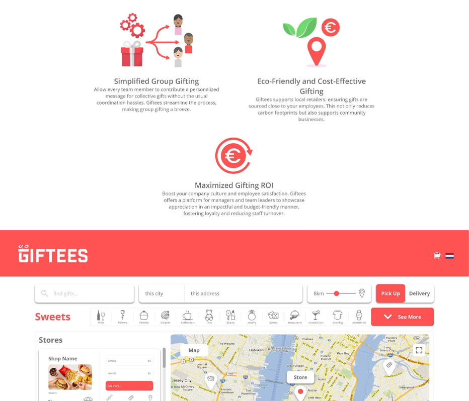
About Section & Shopping Section
We combined various icons and allowed some variation in the colour palette to create the graphics for the About section.
The Shopping section was more complicated, using a real map and pins that allows users to visualise where they are buying from or gifting to.