CSIx Dashboard
Cooperated on the planning, design, and final creation of a data-driven dashboard intended to both record and display large quantities of valuable information and metrics for companies managing CSI portfolios.
The Problem
Effective corporate social investment is rarely limited by funding — it's limited by data. Most organisations managing CSI portfolios are forced to rely on inconsistent metrics, manual monitoring and evaluation processes, and fragmented systems. The result is impact that is anecdotal, leaving opportunities to improve, scale, or redirect investment permanently out of reach.
The Approach
Tackling this problem required immense foundational understanding. This meant that the first step would be in-depth and detailed research regarding CSI portfolios and competing data-platforms. We also maintained direct contact with companies that met the criteria for the ideal consumer, so that we could receive live feedback in response to our progress. Before low-fidelity outputs could be attempted, we first needed to map out the user-journey in the form of a User Flow. This helped us visualize a bigger picture of what exactly we needed to create.
From there, we could separate each step in the flow as a section or frame to design for. It was imperative that the dashboard be as intuitive and easy to digest and navigate as possible, while still including many features that would give it the advantage over competing applications. Low fidelity sketches helped create a picture of how we would achieve this. The feedback at this stage was the most crucial, as messing up the foundation would create many complications later down the line. We presented progress in meetings multiple times every week to ensure that no stone was left un-turned, as well as provided the contractors with live access to our working files where they could leave comments and suggestions.
Once the foundation (Research & Understanding, User Flows, and Low Fidelity Sketches) was complete, we moved on to the Medium Fidelity section. This is where we began Wireframing and creating basic components. The Wireframes displayed as basic and naked placeholders that left room for changes and adjustments based on feedback. This phase proved to be the most time-consuming — with the most feedback received and applied. Although the Medium Fidelity output was frustrating and time consuming, it created an easy pathway for the High Fidelity, or final, output.
High Fidelity output creation comprised of taking the finalised components and company branding, and applying this to the Medium Fidelity Wireframes. During this process, we did a lot of cross-checking and revisiting to ensure that everything was as the client requested.
Progress
Visuals provided for various ‘landmarks’ throughout the duration of the project.
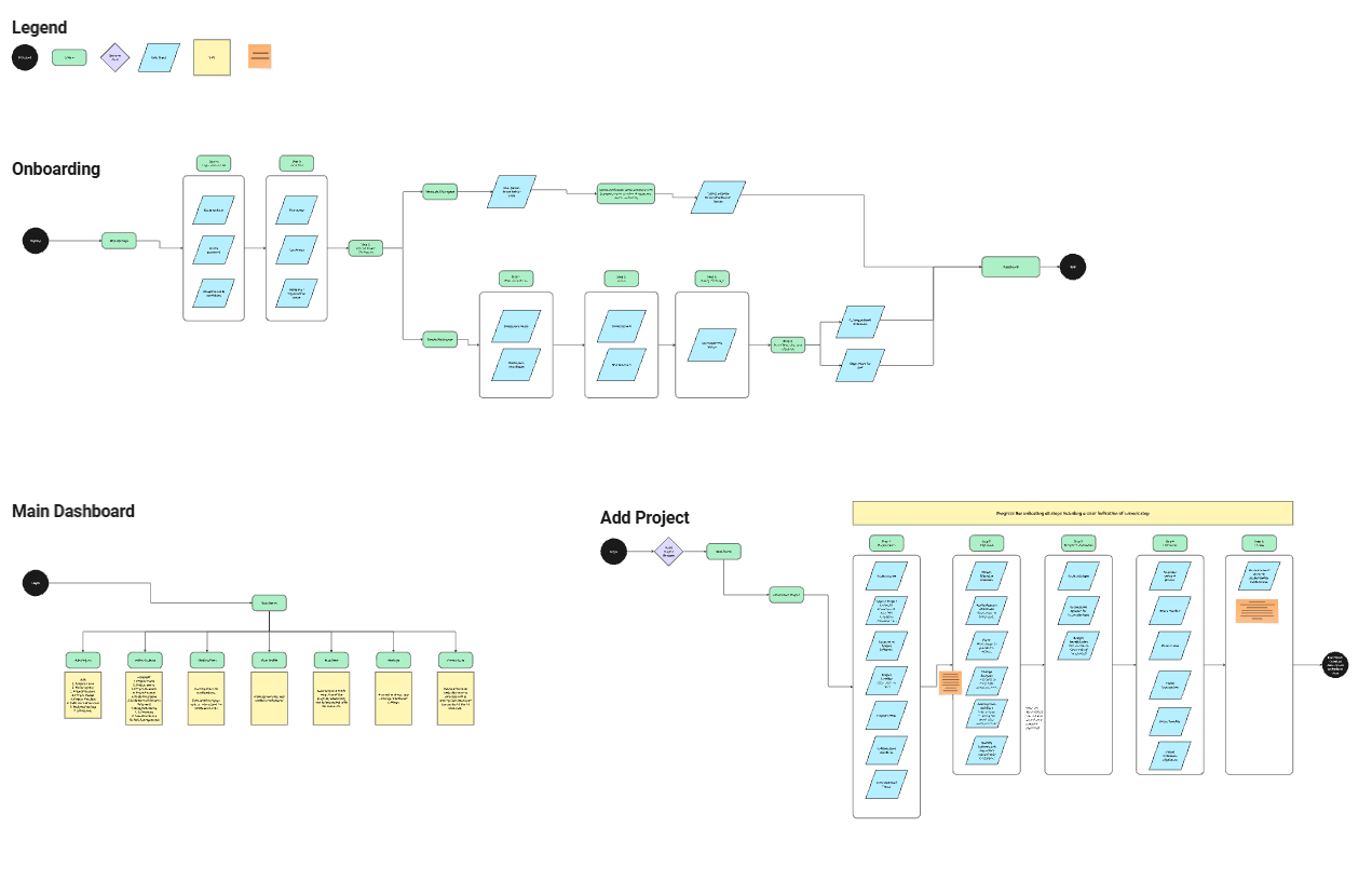
User Flows
Mapping out the user journey in a flowchart allowed us to visualise what we were designing, as well as notice any gaps before the foundation is set.
We used a standard ‘User Flow’ layout, creating and combining various different flows like pieces of a puzzle until we had the full picture.
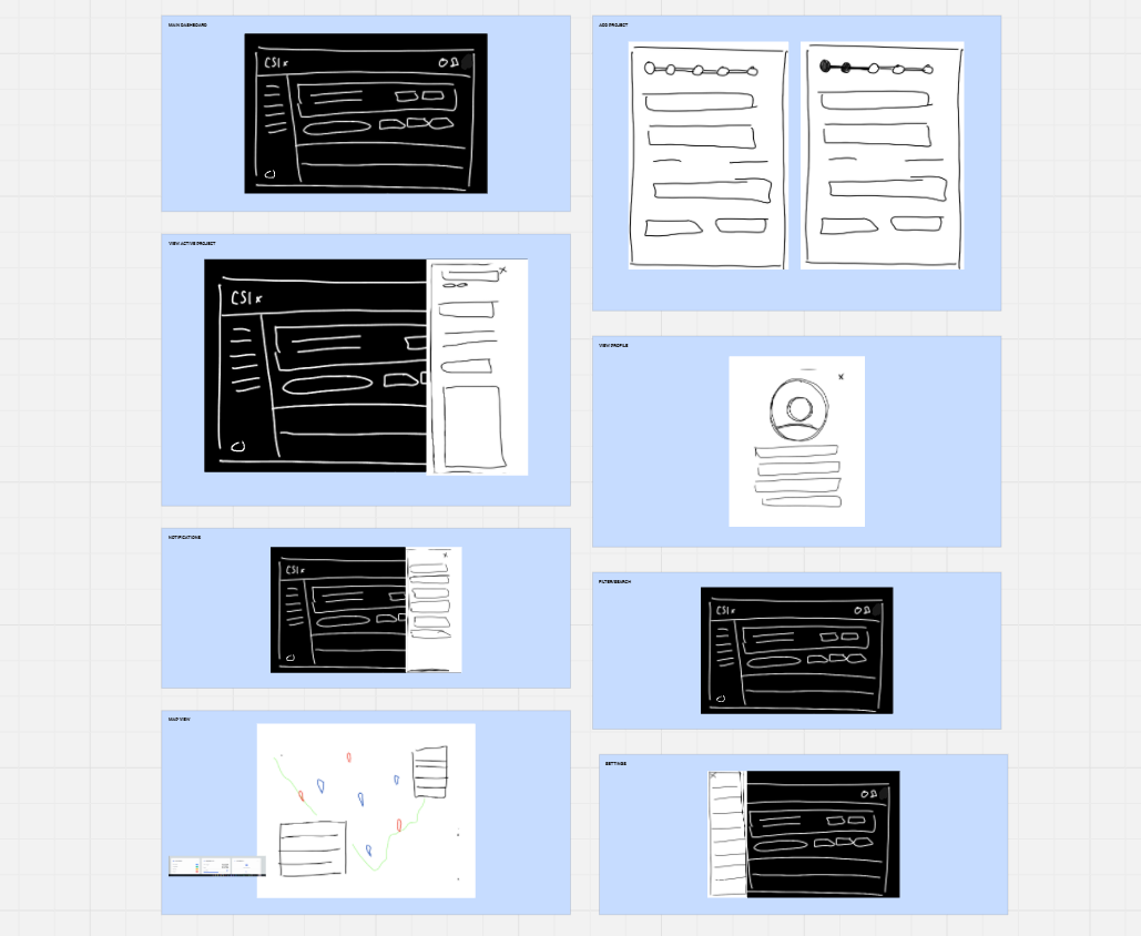
Low Fidelity Sketches
Each flow was turned into a series of very rough digital sketches. While lacking detail, they helped us understand what needed to be done.
These sketches were to start confirming the layout, as well as the overall look and feel for the user.
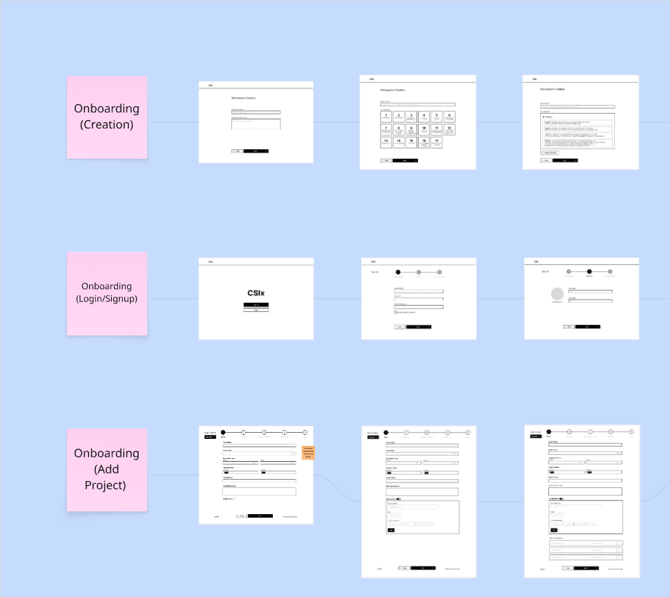
Medium Fidelity Wireframes
Wireframing proved to be the most time-consuming and difficult portion of the project. This is where the process and functionality were finalised.
Creating detailed and complete Wireframes require all bugs and changes to be ironed out before they can be completed.
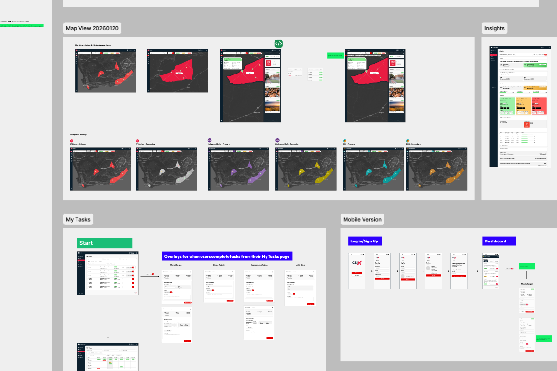
High Fidelity Output
High Fidelity is all about the look, feel, and final details. The app itself was now completed, and it now required the company branding and style to be applied.
This phase is fairly fast, using mostly pre-made components and assets.
Outcome
The final product was a fully intuitive and data-driven dashboard, solving the problem of unmeasured impact repelling investors from interest in CSI portfolios, while still being simple to use and pleasing to the eye.
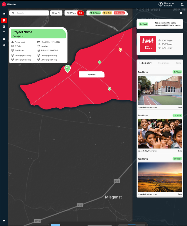
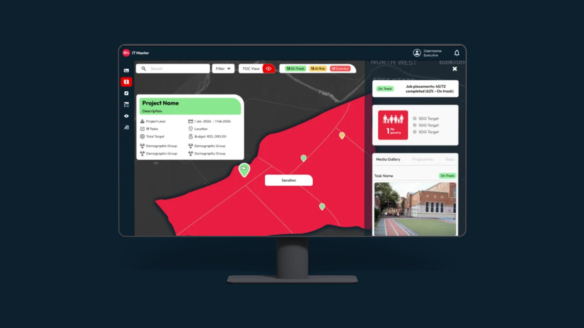
High Fidelity Output — Project Overview (Map View)
A look at the final Project View, in ‘Map Display’ with pins to represent the location of each project.
Clicking on a pin brings up detailed project information, as well as a media gallery containing visual evidence of impact.
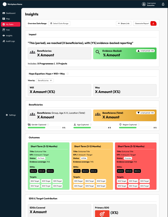
High Fidelity Output — Insights Page
A look at the final Insights page, displaying the finance based metrics so that impact becomes tangible.
Information can be shared through a link to the page, or a report can be generated and downloaded for a more professional output.